WordPress is finally getting theme.json support for form styling. Before breaking out the big fireworks in celebration, a fair warning: it’s limited to a subset of elements. Specifically, text inputs and select dropdowns. So…maybe some mini fireworks.
Form styling has long been requested since the introduction of theme.json, and the changes coming in WordPress 6.9 are the first iteration of what I expect to be many and the way toward a complete solution.
In this article, I will walk you through what you can use theme.json for and what currently requires custom CSS.
Table of Contents
Adding styles via theme.json
WordPress 6.9 adds two elements that you can style via theme.json:
select: Targets<select>HTML elements.textInput: Targets<textarea>and<input>elements with atypeattribute of the following:emailnumberpasswordsearchtexttelurl
You must define element styles under the styles.elements property in theme.json. For example, here’s where you would add styles for selects and text inputs:
{
	"$schema": "https://schemas.wp.org/trunk/theme.json",
	"version": 3,
	"styles": {
		"elements": {
			"select": {},
			"textInput": {}
		}
	}
}
Styling select dropdowns
WordPress doesn’t have many blocks that output a <select> element. To test your custom styles for it, I recommend inserting either the Categories List or Archives block into the editor. You can output either as a dropdown by enabling the Settings Display as dropdown option in the block inspector.
Ultimately, the plan is to style the blocks so that they look like this on the front end:
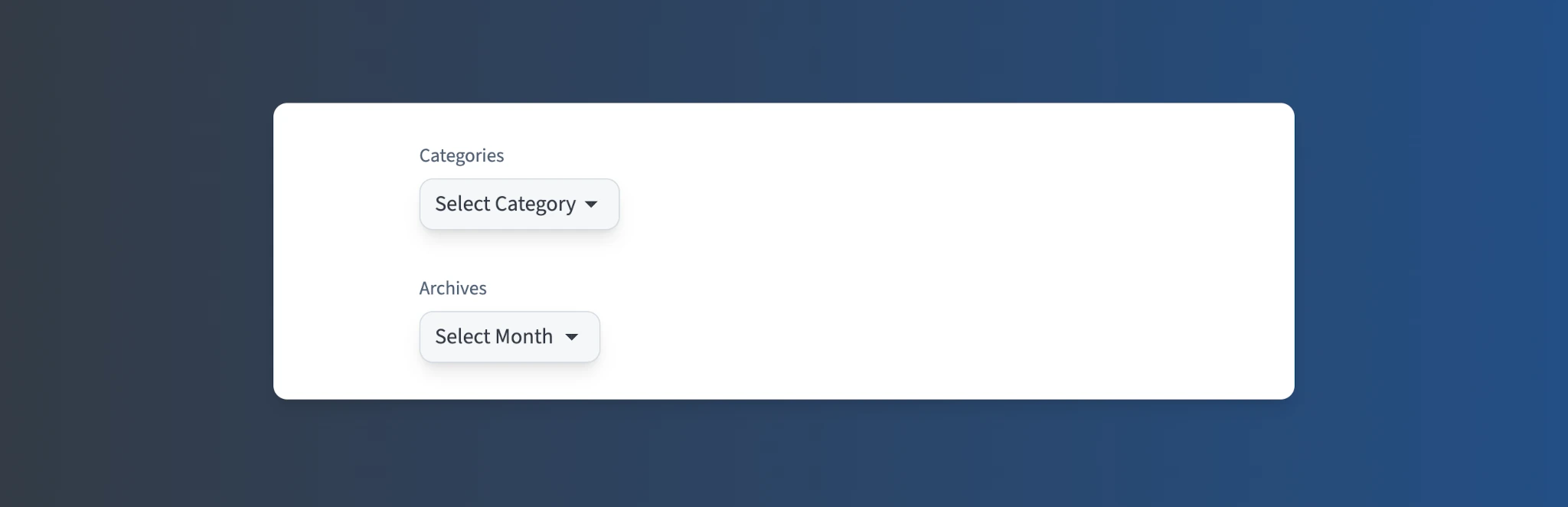
Like other elements in theme.json, it supports the full array of styling options. The design in the screenshot above uses custom border, color, outline, shadow, and spacing properties.
Add the new select element to your theme.json as shown here:
{
	"$schema": "https://schemas.wp.org/trunk/theme.json",
	"version": 3,
	"styles": {
		"elements": {
			"select": {
				"border": {
					"color": "#d5dae2",
					"style": "solid",
					"width": "1px",
					"radius": "0.75rem"
				},
				"color": {
					"background": "#eceff2",
					"text": "#22272f"
				},
				"outline": {
					"color": "transparent",
					"offset": "2px",
					"style": "solid",
					"width": "2px"
				},
				"shadow": "0 10px 15px -3px #0000001A, 0 4px 6px -4px #0000001A",
				"spacing": {
					"padding": {
						"top": "var(--wp--preset--spacing--10)",
						"bottom": "var(--wp--preset--spacing--10)",
						"left": "var(--wp--preset--spacing--30)",
						"right": "var(--wp--preset--spacing--30)"
					}
				}
			}
		}
	}
}
Of course, this will likely look different depending on the theme that you’re using. And, as always, I encourage using presets instead of hardcoded values.
The above code adds a global style for the <select> HTML element across the entire site, including those used in third-party plugins. However, depending on the styles for those plugins, they may need to be updated to ensure they are not overriding theme.json styles once WordPress 6.9 ships.
You may have noticed that I intentionally set outline-color to transparent. This is because I don’t want it to show until the element is focused.
Unfortunately, WordPress 6.9 will not ship with focus state styling for form elements. There’s a work-in-progress patch for that. You’ll learn how to address this limitation with CSS later in this tutorial.
Styling text inputs and textareas
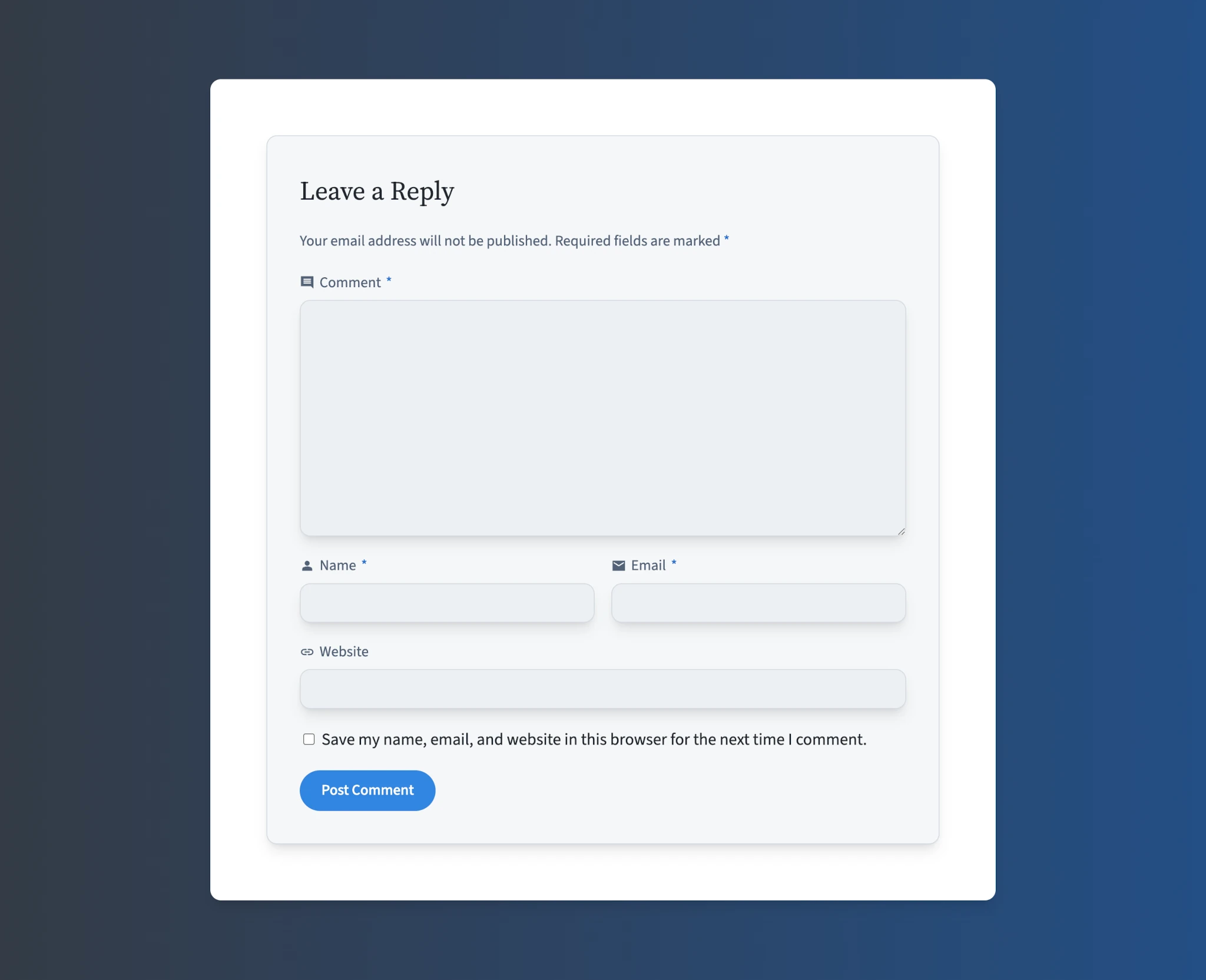
Styling text inputs and textareas is a little more fun, mostly because there is a larger variety of WordPress blocks to test. For this example, I’m showcasing the Comments Form block, but these styles will also apply to Login/out, Search, and any third-party blocks that have an <input> or <textarea>.
Let’s try adding some styles for text inputs so that they look similar to this:
In this case, the styles for textInput are exactly the same as those for select. This isn’t much of a surprise for people who work with CSS since the elements typically share styles.
Add the new code for textInput to your theme.json:
{
	"$schema": "https://schemas.wp.org/trunk/theme.json",
	"version": 3,
	"styles": {
		"elements": {
			"textInput": {
				"border": {
					"color": "#d5dae2",
					"style": "solid",
					"width": "1px",
					"radius": "0.75rem"
				},
				"color": {
					"background": "#eceff2",
					"text": "#22272f"
				},
				"outline": {
					"color": "transparent",
					"offset": "2px",
					"style": "solid",
					"width": "2px"
				},
				"shadow": "0 10px 15px -3px #0000001A, 0 4px 6px -4px #0000001A",
				"spacing": {
					"padding": {
						"top": "var(--wp--preset--spacing--10)",
						"bottom": "var(--wp--preset--spacing--10)",
						"left": "var(--wp--preset--spacing--30)",
						"right": "var(--wp--preset--spacing--30)"
					}
				}
			}
		}
	}
}
Once you’ve added your styles, test one of the blocks that display inputs or textareas.
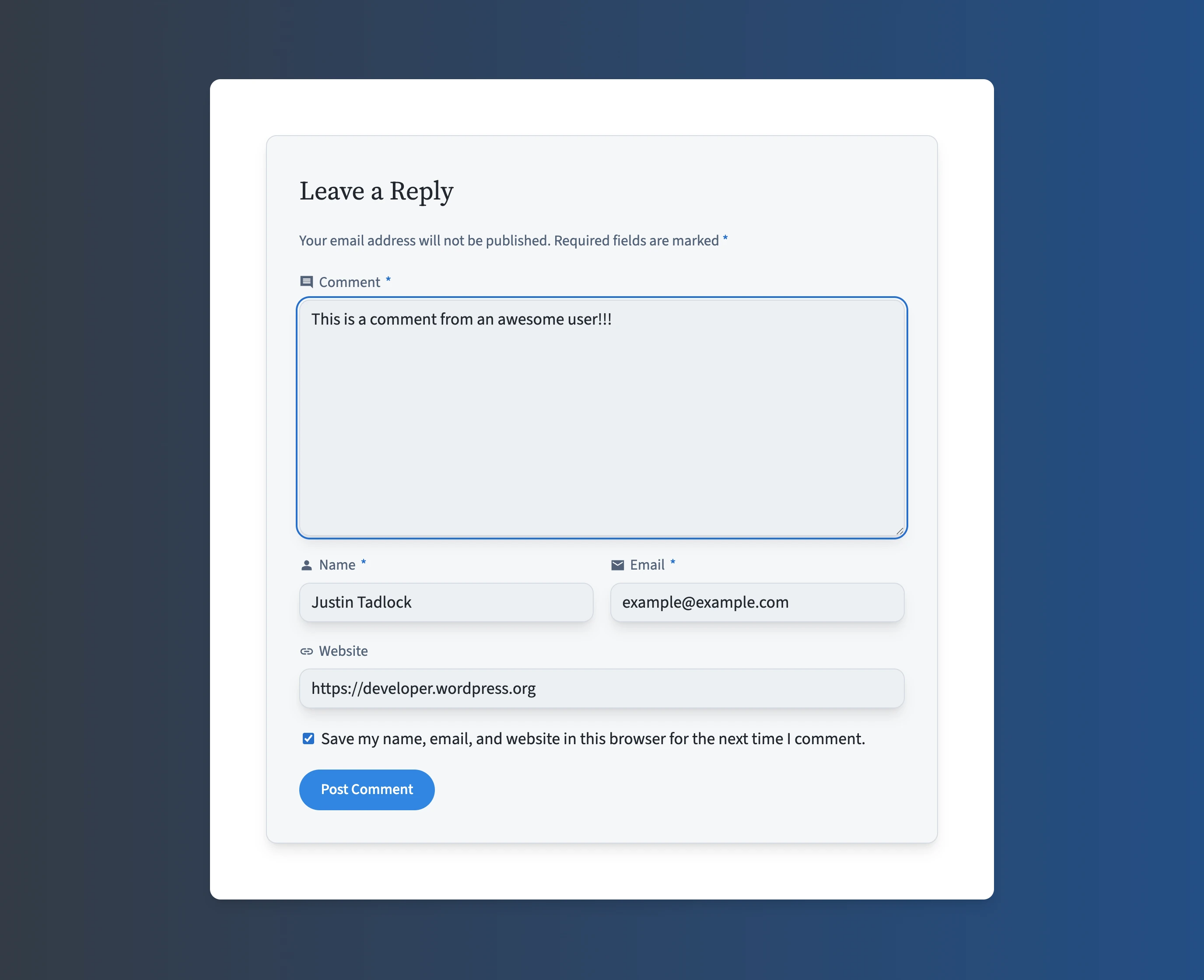
Filling in the gaps with CSS
For this particular design, I had a few styles that needed custom CSS. Because these are global styles and not tied to any single block, I added them to my theme’s style.css.
Note that some block themes do not automatically enqueue their style.css file. If that’s how your theme works, please review the Including Assets documentation to load the stylesheet.
As shown in this screenshot, the custom styles I added are a focus outline, label styles, and a caret color (i.e, the text cursor color):
Styling unsupported properties
A nice touch for text inputs is giving the caret a custom color of its own that makes it stand out from the text itself. The caret is the blinking indicator when typing in text fields.
To target the same elements as WordPress, use the following code:
textarea,
input:where([type=email], [type=number], [type=password], [type=search], [type=text], [type=tel], [type=url]) {
	caret-color: #2770ce;
}
Of course, you can add any other properties that are not supported. Above, the code adds support for the CSS caret-color property.
Adding focus styles
Because WordPress doesn’t support CSS :focus and other pseudo classes in theme.json for its form elements, you must add these via custom CSS, too.
If you recall from earlier, the outline-color for both selects and text inputs was defined as transparent in theme.json. Ideally, this should change when a user focuses on an element, giving a visual indicator that they’re interacting with it.
Add this code to your theme’s style.css to change the outline color when focused:
textarea:focus,
input:where([type=email], [type=number], [type=password], [type=search], [type=text], [type=tel], [type=url]):focus,
select:focus {
	outline-color: #2770ce;
}
Add extra element styles
Since WordPress 6.9 will support only text inputs and selects, it leaves a lot of room for more element support in the future. In the still-open, original ticket for styling forms, there are many elements listed that you may need to style via CSS.
One of the most common elements that you’ll likely want to handle is <label>. It’s a standard sibling (or parent) element with most other form elements.
To achieve the custom colors and typography shown in the screenshot, add this code to your theme’s style.css file:
/* Basic label styling. */
label {
	color:     #526277;
	font-size: 1rem;
}

/* Reset when the label is next to or wraps a checkbox or radio. */
input[type="checkbox"] + label,
input[type="radio"] + label,
label:has(input[type="checkbox"], input[type="radio"]) {
	color:     inherit;
	font-size: inherit;
}
For these styles, you’ll notice that I specifically reset label styles when they are paired with a checkbox or radio input. These generally have a different design than labels paired with other form elements.
Of course, what CSS properties you need will differ depending on the theme you’re using, so customize to fit your needs.
Even though these are custom style rules in a separate stylesheet, I highly encourage integrating them with theme.json. To learn more about doing this, check out Adding and using custom settings in theme.json.
Further reading
This is just the start of the journey for styling form elements. While it is not a complete set, it is a welcome iteration, and I would love to see even more support added in WordPress 7.0 and beyond.
To follow along with future updates, I encourage subscribing to these GitHub tickets:
- Consider adding form elements to the theme.json elements block
- Support ::placeholder CSS pseudo-element in theme.json
- WIP: Add pseudo elements support for textinput elements
- Global Styles – expose way to add more ‘Elements’ to the UI
Props to @bph and @welcher for feedback and review on this article.
Leave a Reply to Justin Tadlock Cancel reply